Case Study
Fitameen.
Activating a communication
agency’s newfound philosophy.
Issue
With its recent brand evolution, “Brands Captivate Audiences,” Fitameen has an incredibly strong point of view on the digital communication scene. But stakeholders weren’t aware of the new positioninfsdfsdfdsfdnd felt way before it is proven on actual projects.
Insight
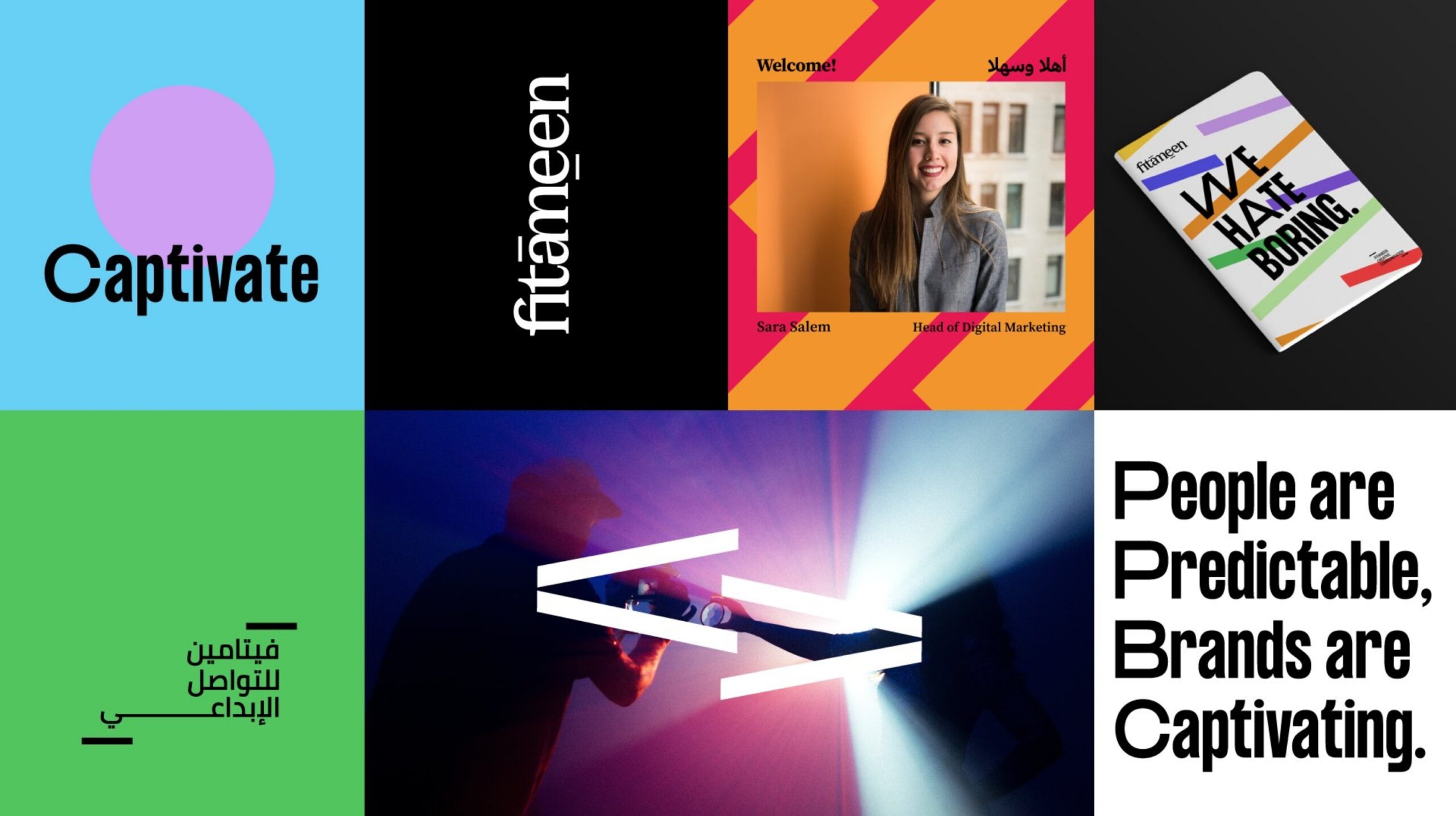
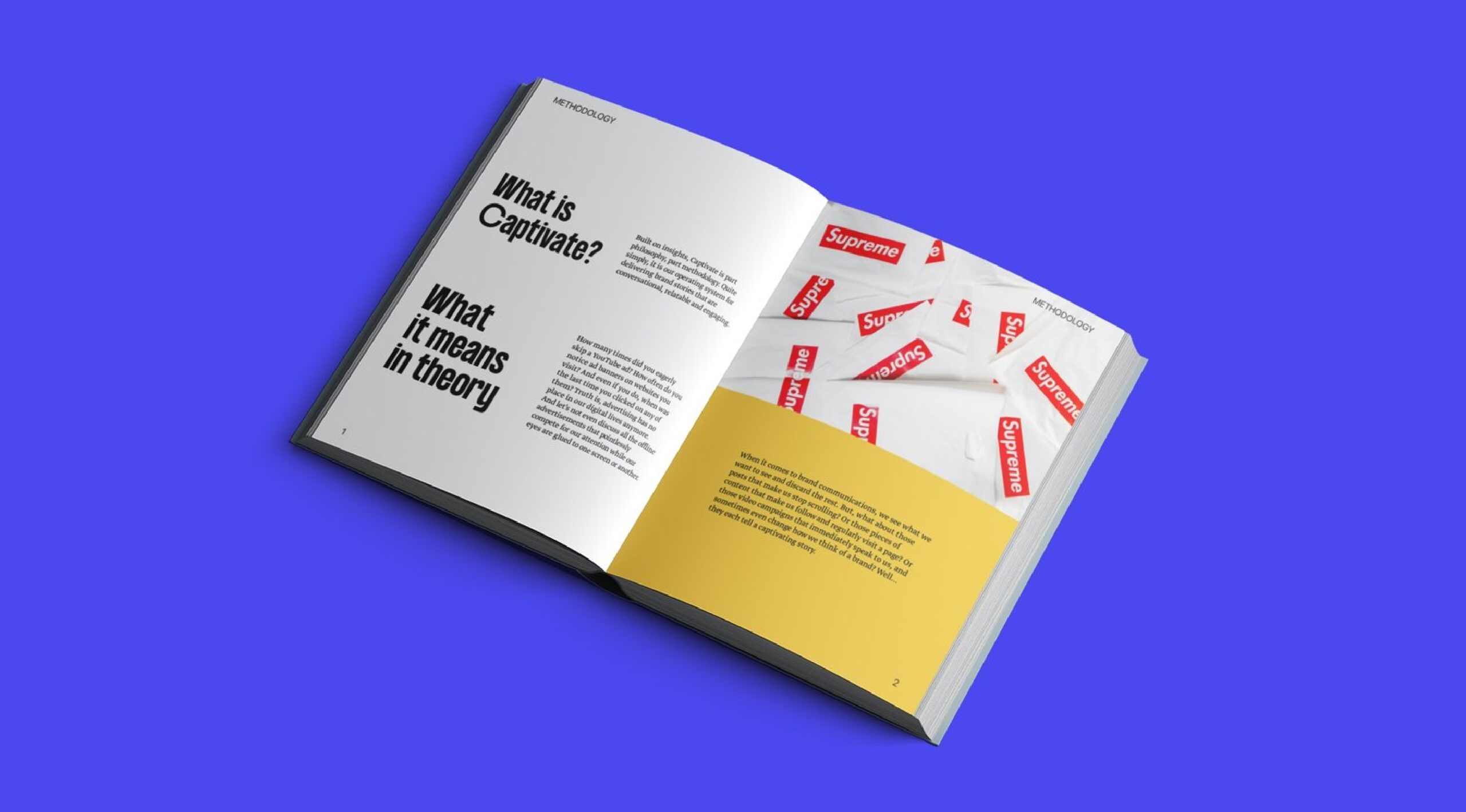
We knew that Fitameen could stand out and make an impact by standing tall on its new point of view, so we aligned the organization around its core philosophy: Captivate your audience. The idea, central to their methodology, defines Fitameen’s role in its clients’ lives. It also gave us the strategic and creative springboard we needed to refresh the brand’s visual identity, celebrate its internal culture and, ultimately, keep its brand experience on the top level as creatively corporate.
Solution
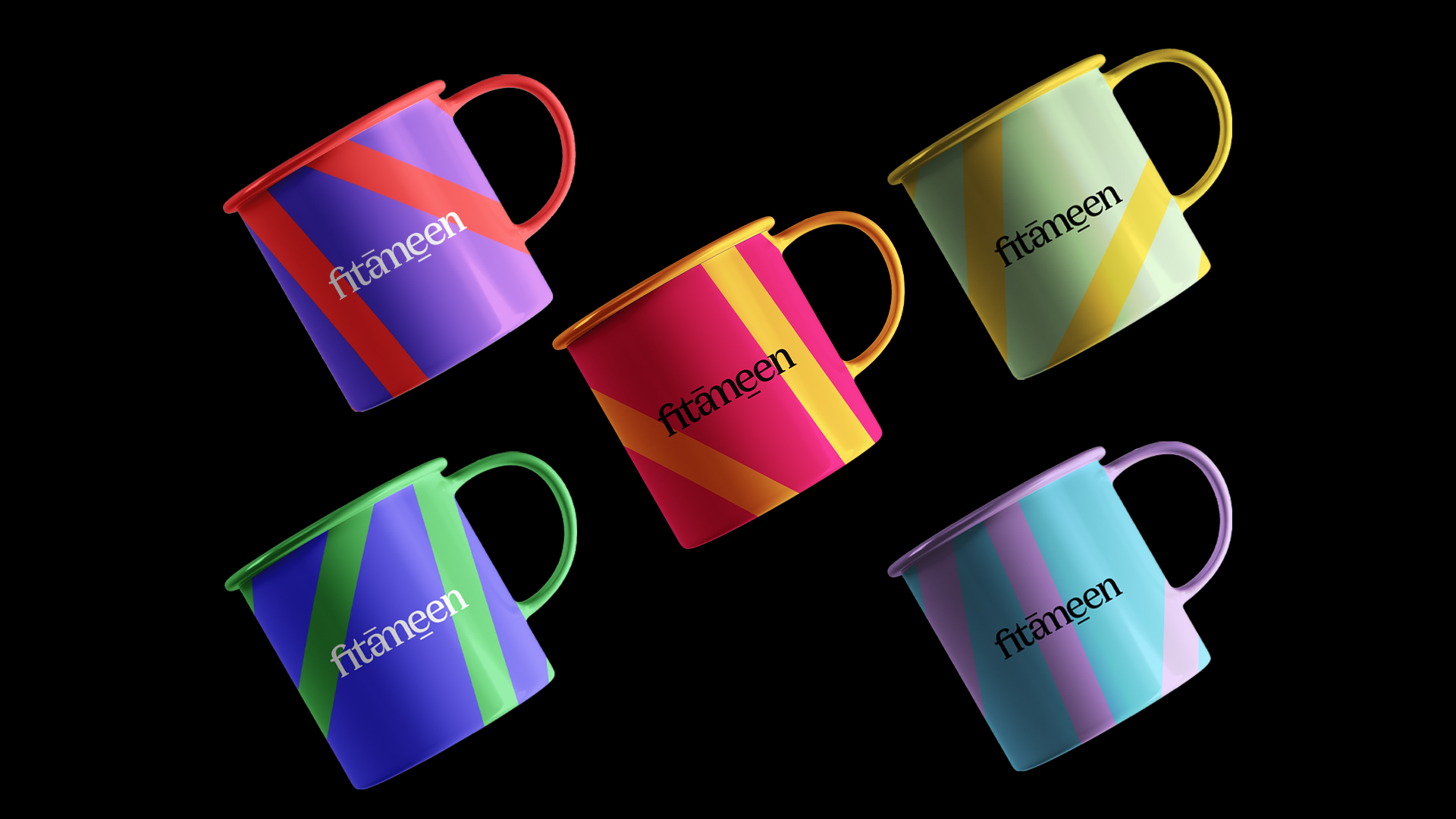
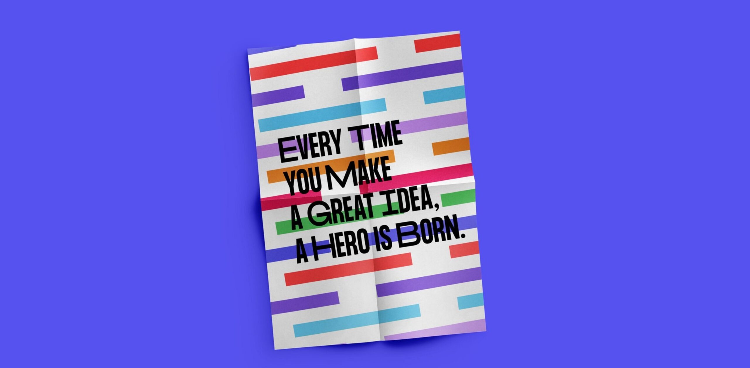
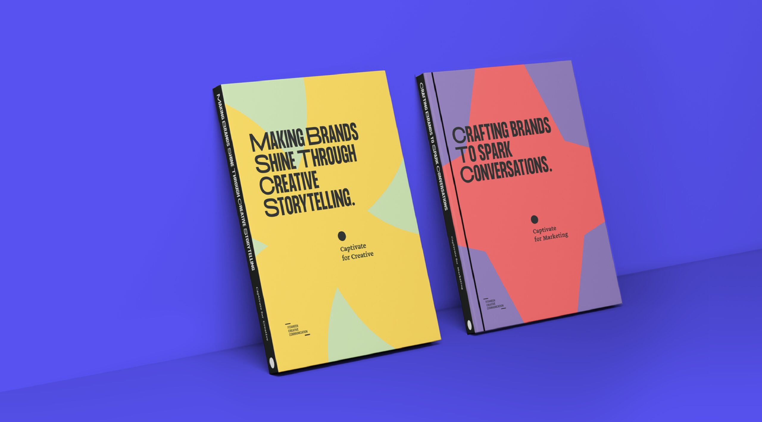
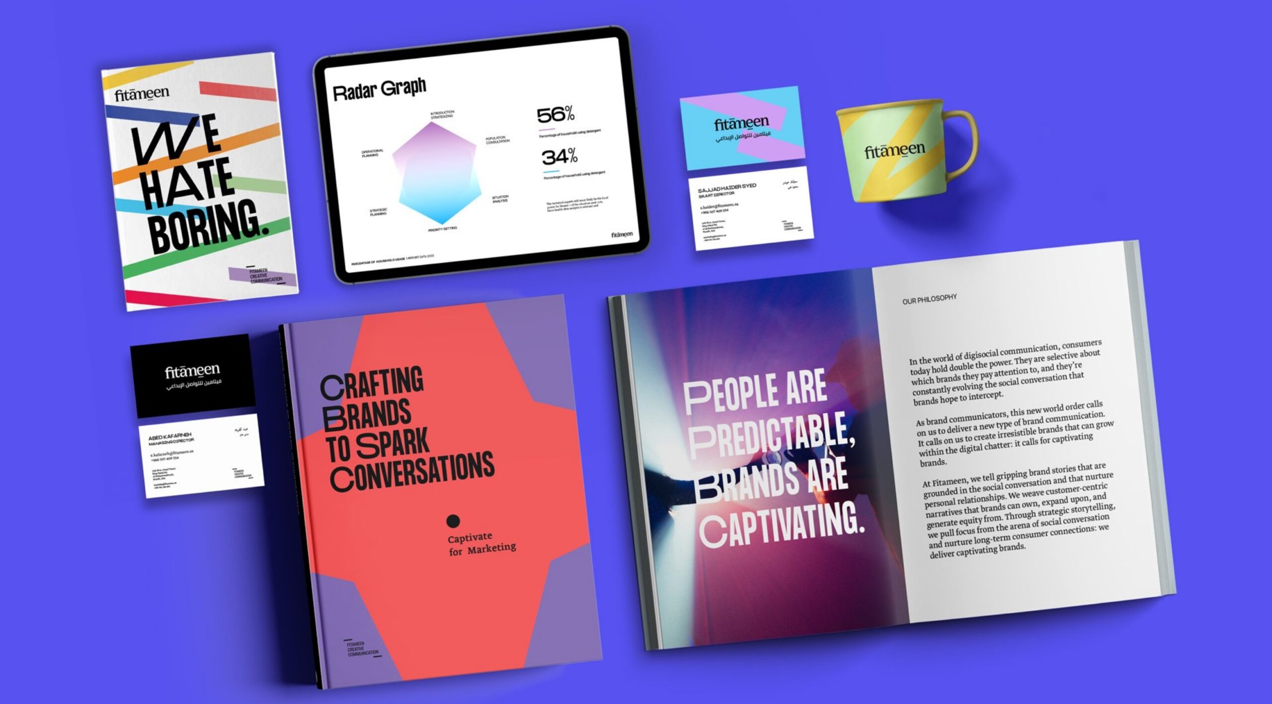
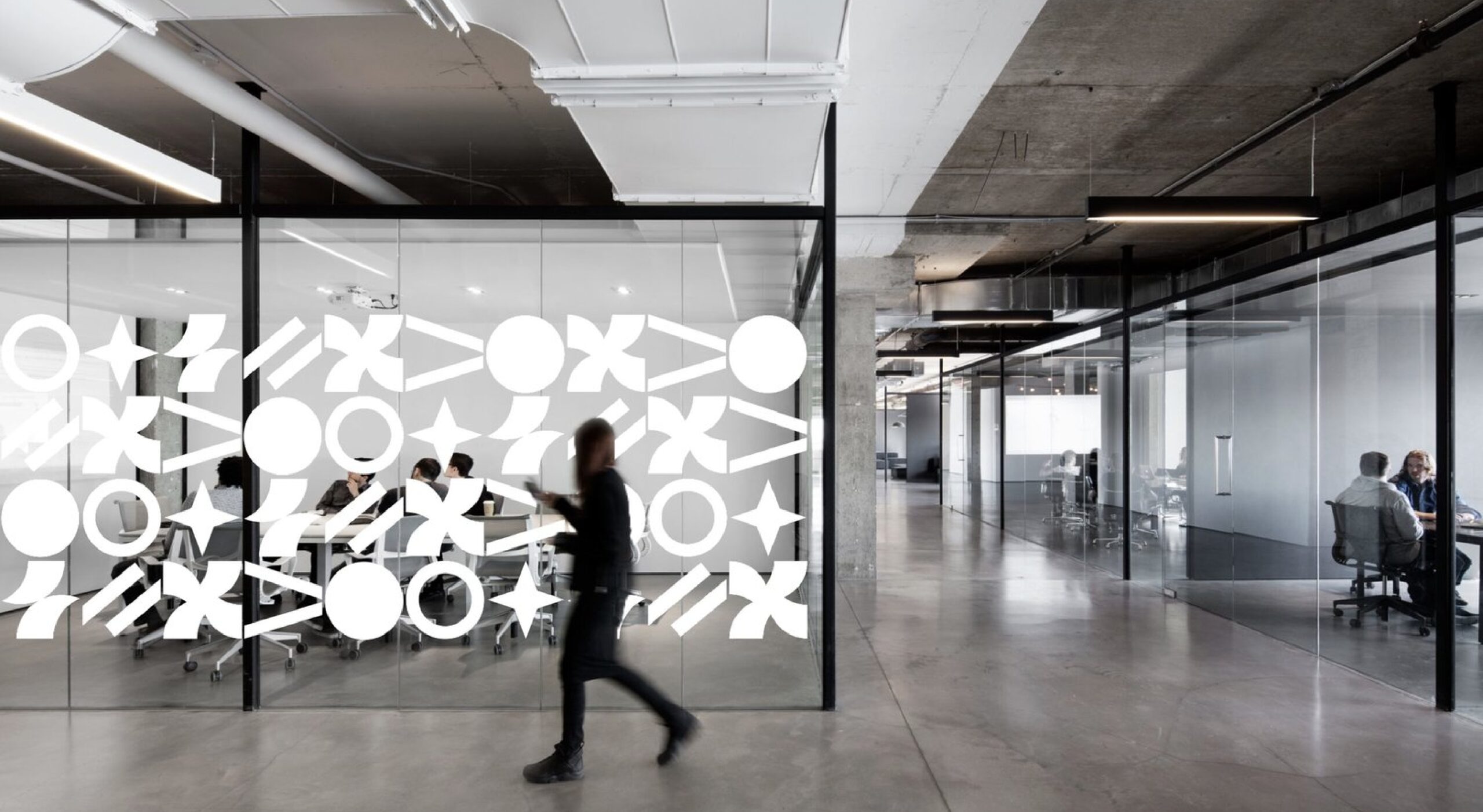
With the idea of “captivate” at hand, we developed a graphical system that details Fitameen’s simple yet powerful point of view. We turned it into a language that can be amplified whenever we want to show creative potential.
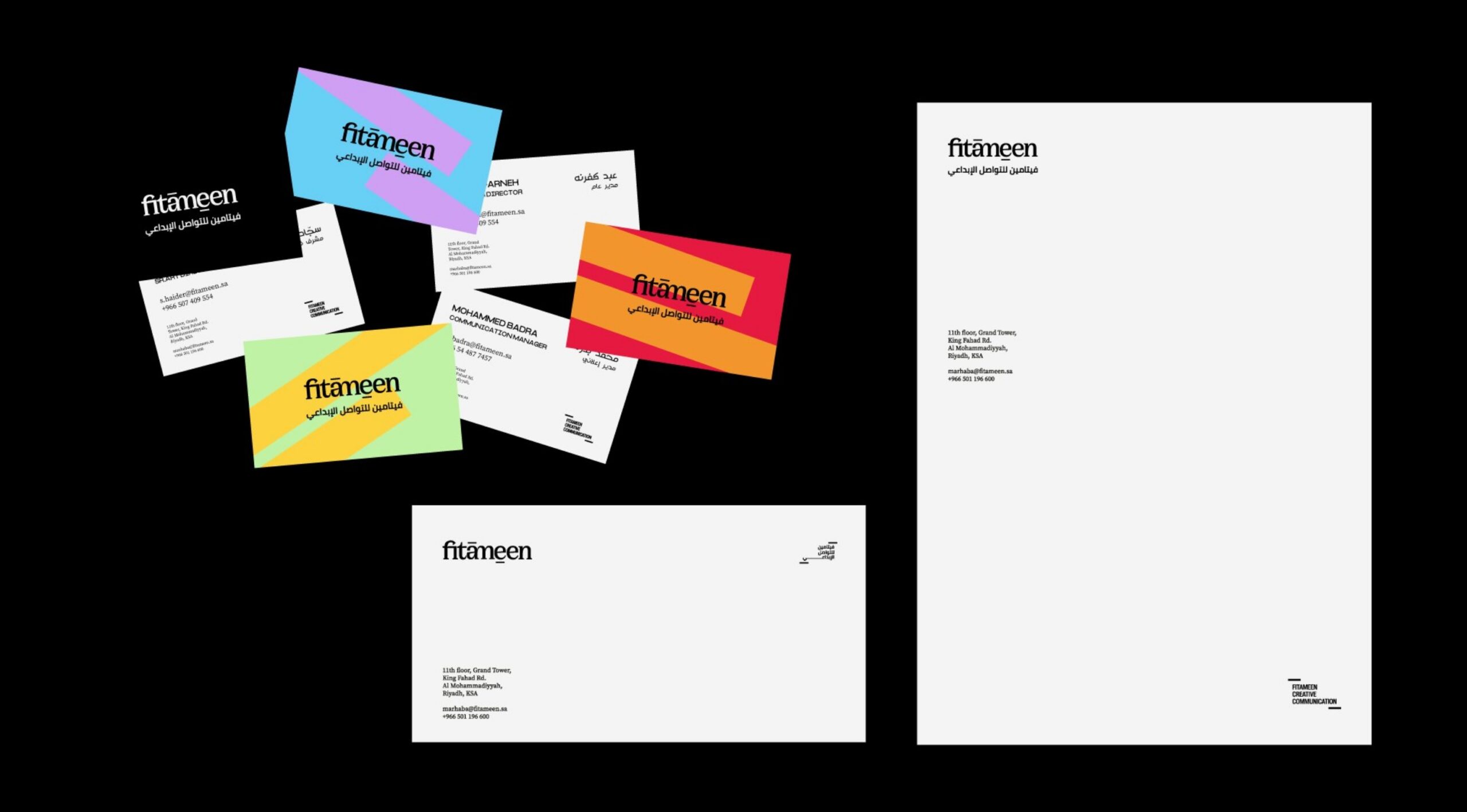
Having created a rich language in graphics and colors, we simplified the corporate palette and wordmark to show strength. Keeping them centered around the brandmark of communication and its endless possibilities.
Fitameen’s philosophy is simple, rooted at the bafsdfsdfsd, a sender and a receiver in the digital age.
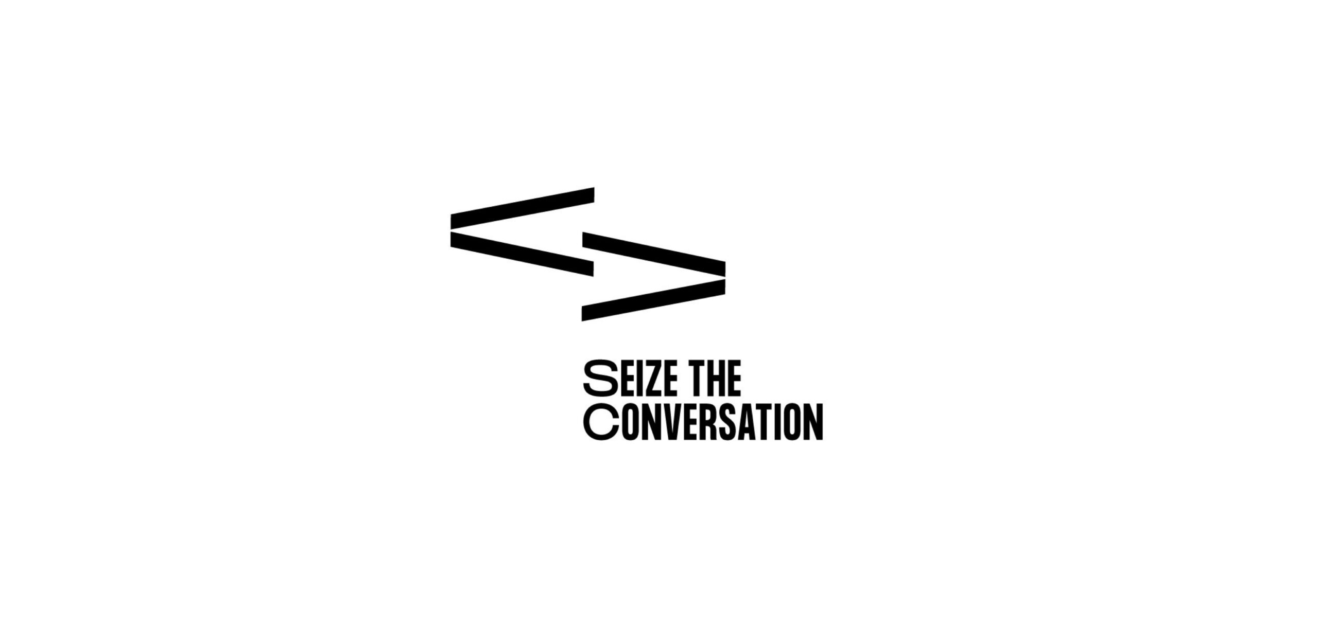
We re-addressed the logo design and introduced a “communication mark,” the two rectangles that symbolizedfsdfsdfdsfbrand and enabled a dynamic branding representation that leverages the power of Fitameen’s descriptive: “creative communication.”
Hey there, this is the default text for a new paragraph. Feel free to edit this paragraph by clicking on the yellow edit icon. After you are done just click on the yellow checkmark button on the top right. Have Fun!
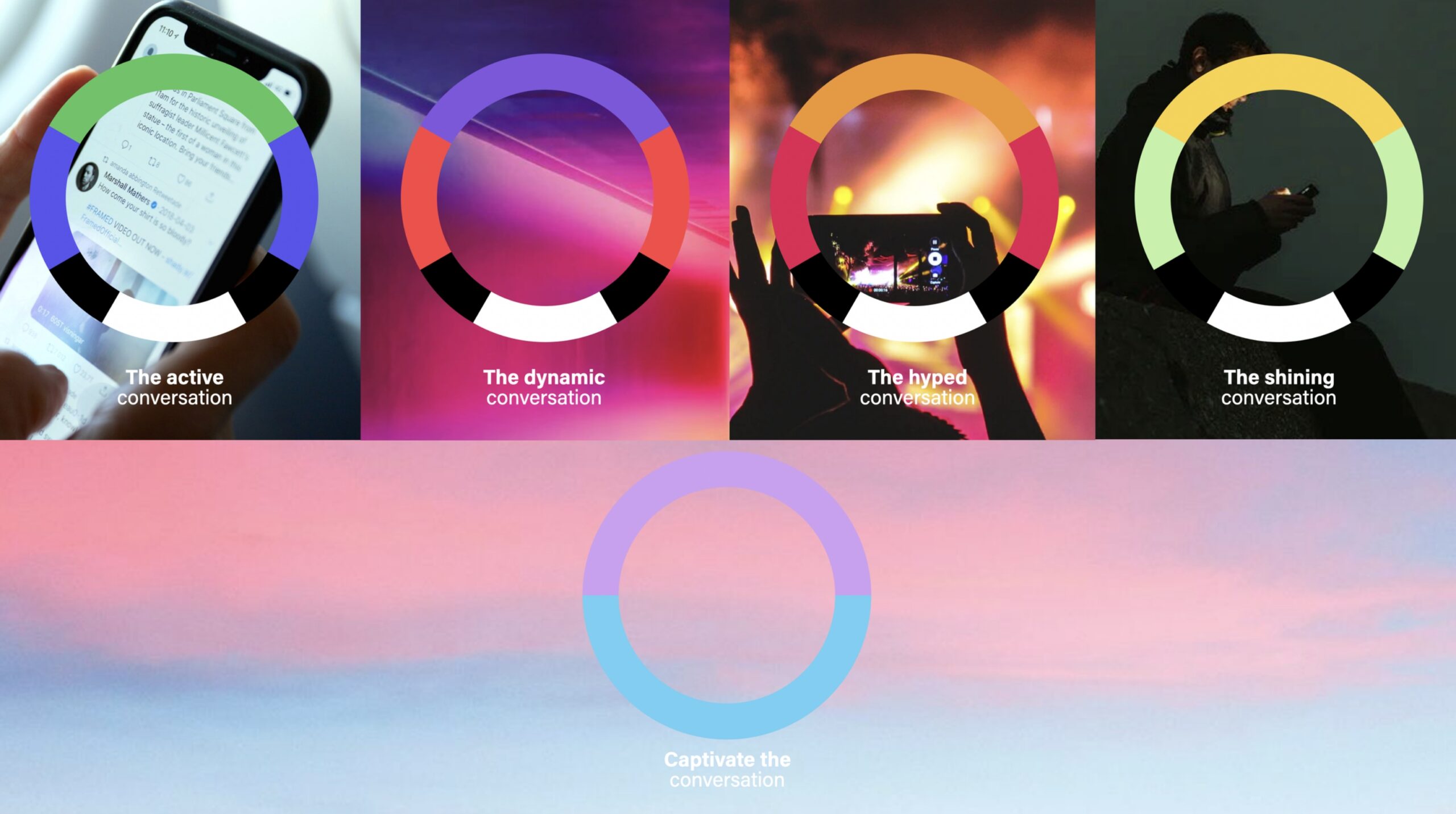
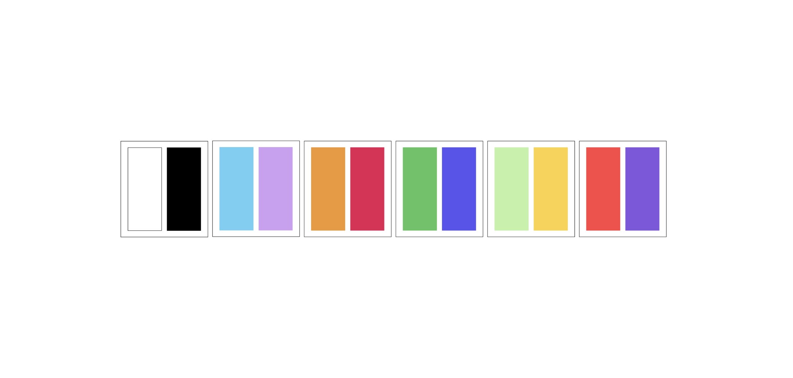
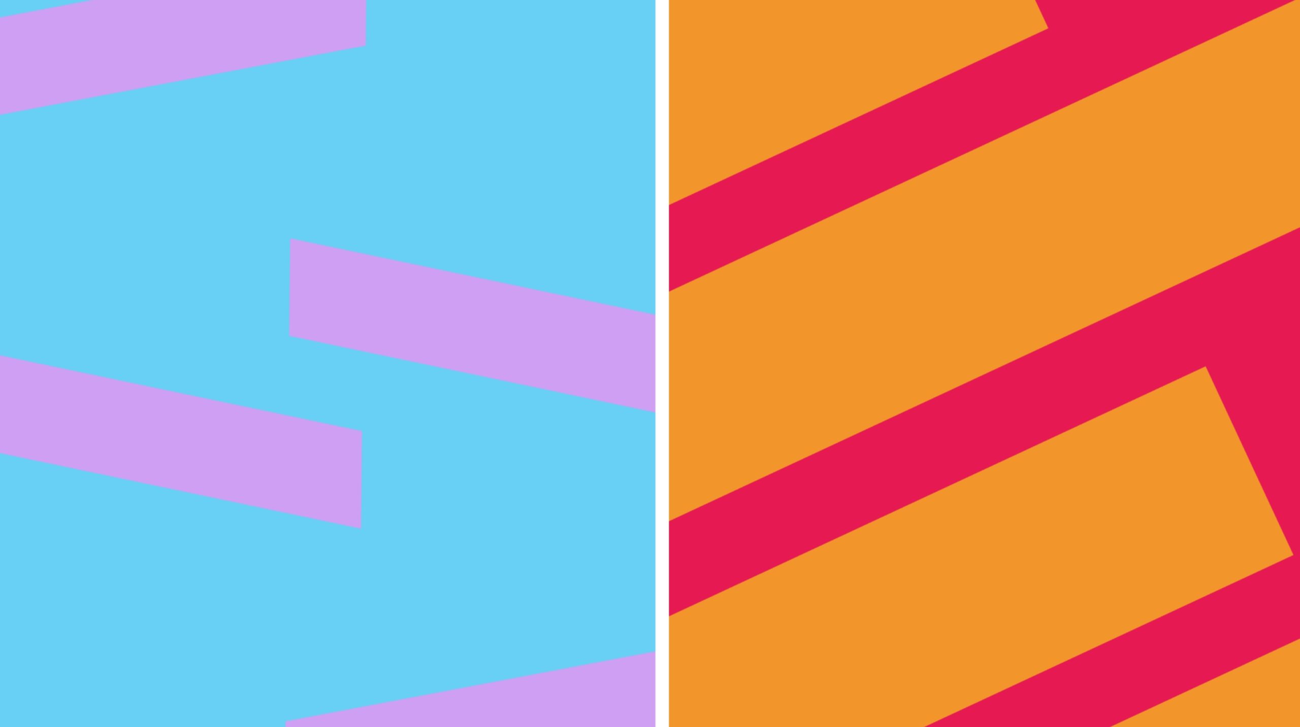
Color plays a central role in the new identity. The core color palette is black and white for corporate impact, complemented by dual color systems that categorize the conversation, all the way from social listening up to hyped and dynamic.
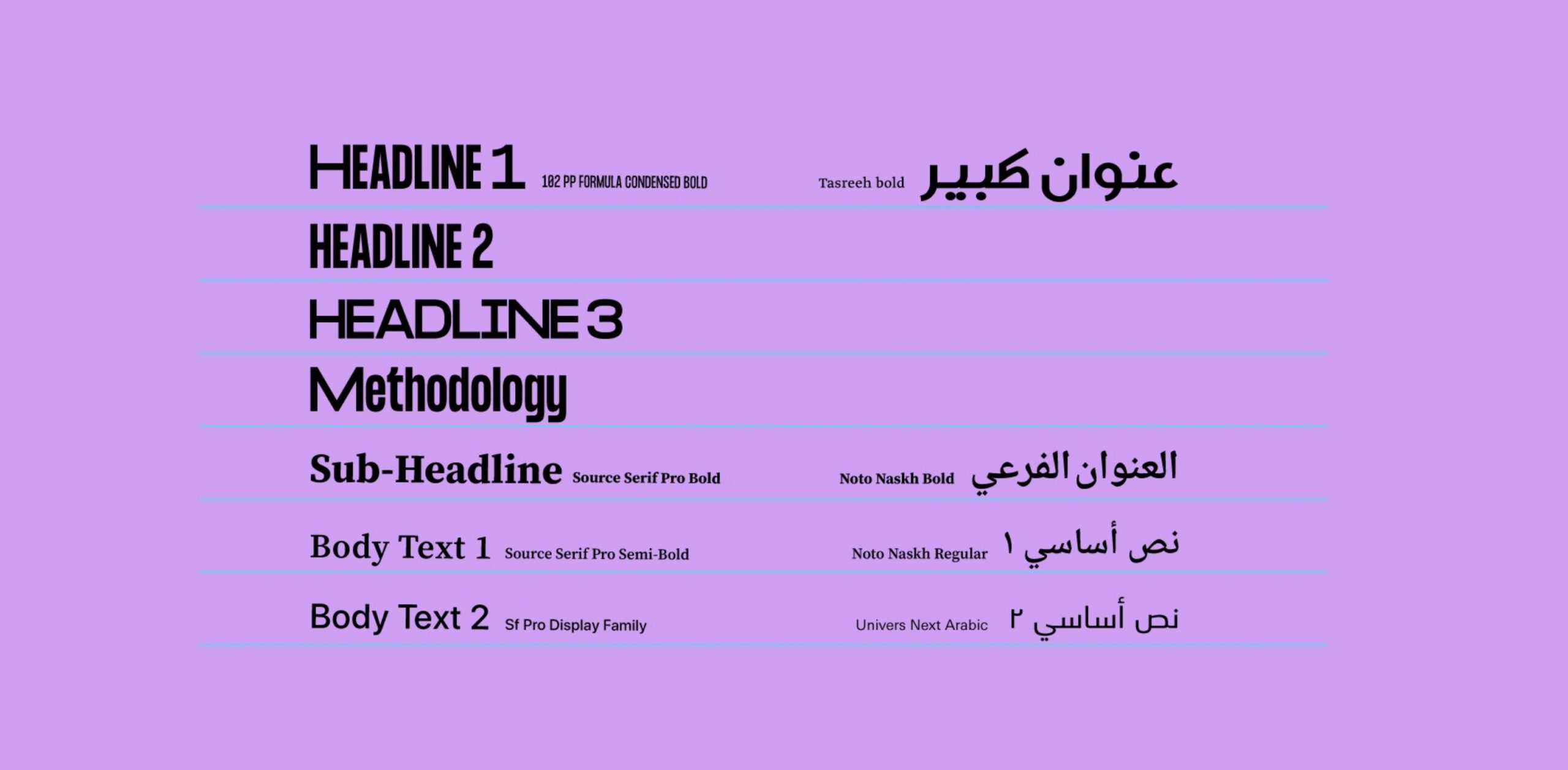
The new identity needed to be bold and typographic, have a connection with the world of written communication and can translate seamlessly into the brand’s verbal culture.
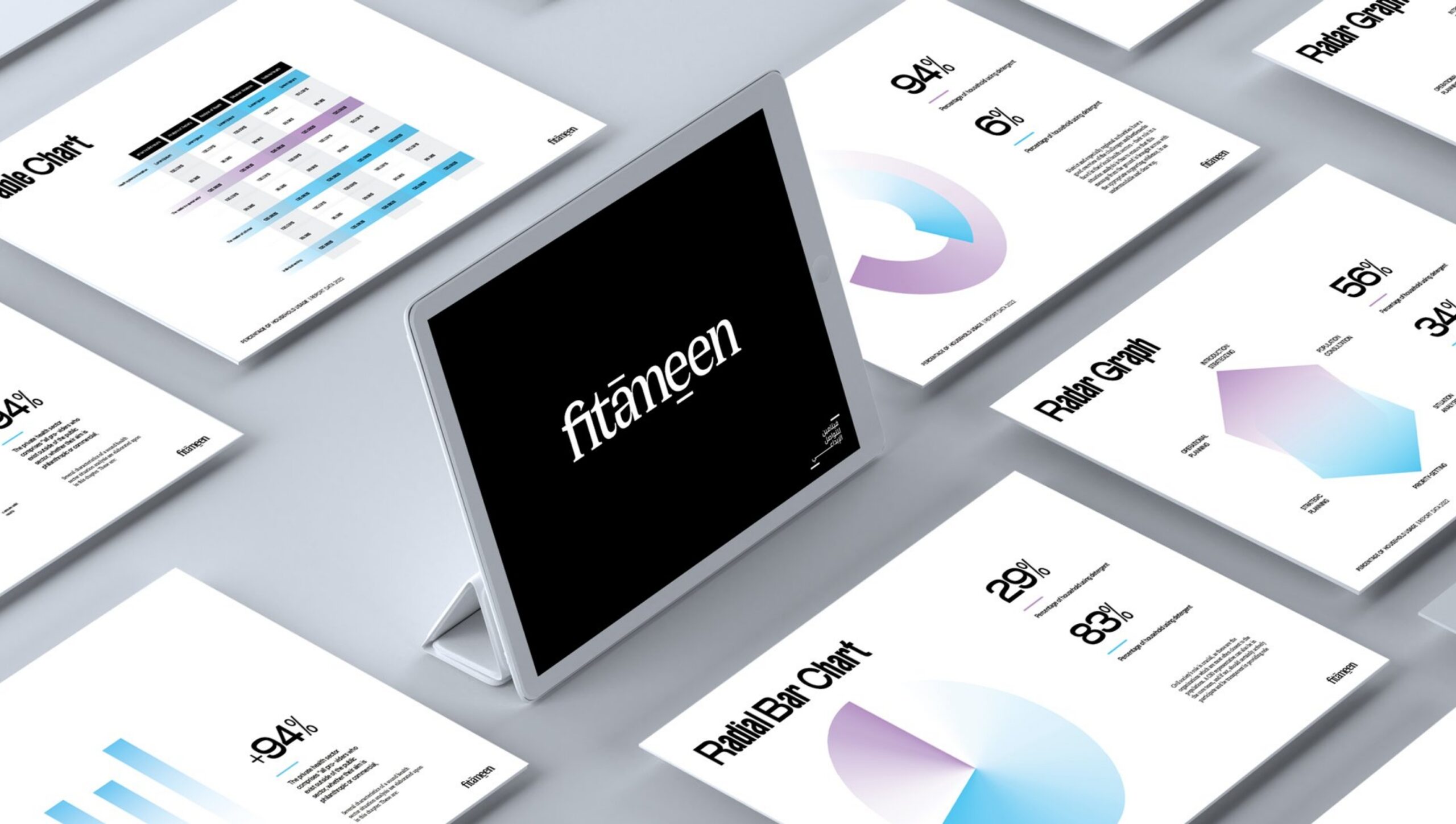
Fitameen’s methodology and philosophy create building blocks for communication creativity; this principle was carried through to the identity by building the methodology system into a corporate curriculum.
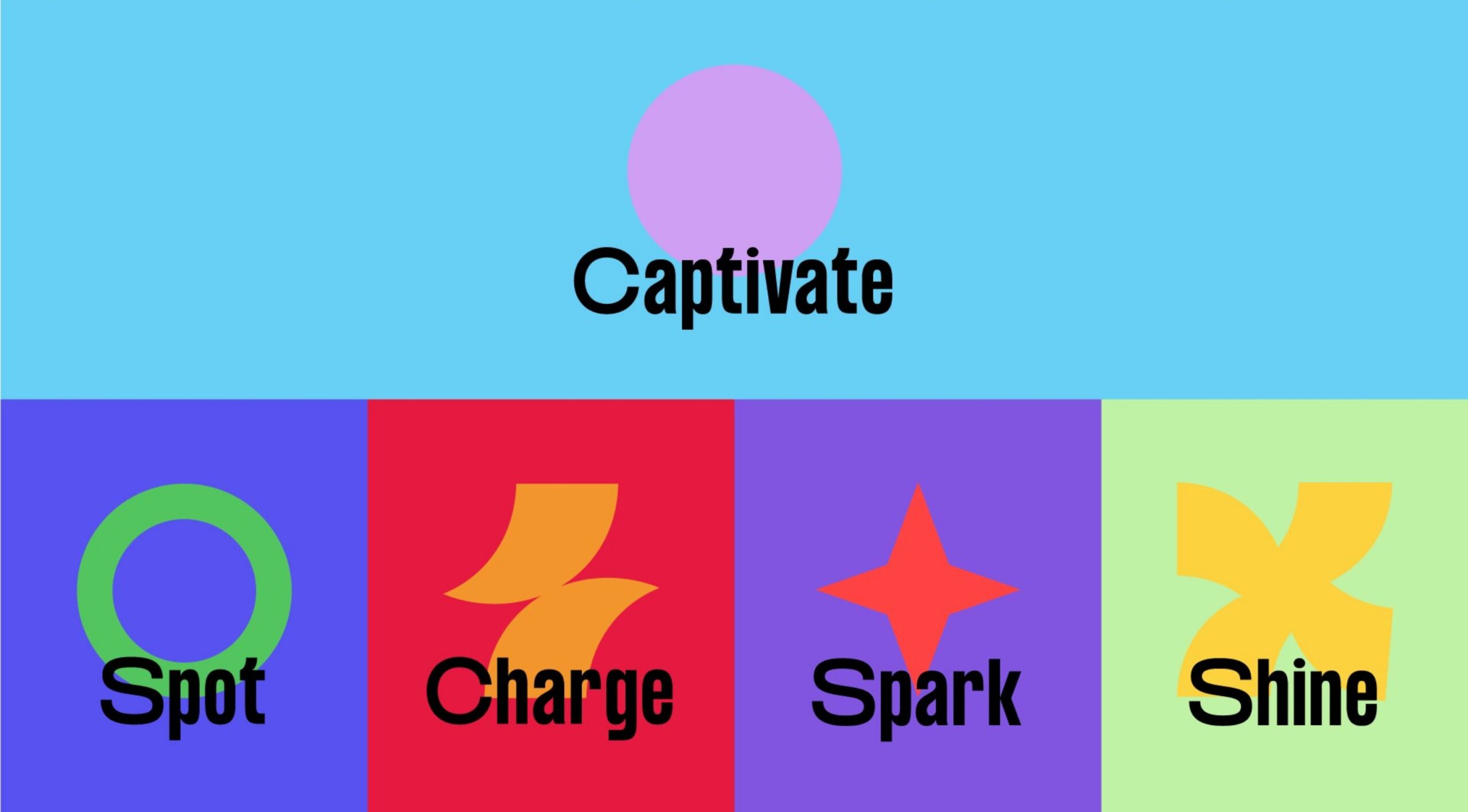
The exuberant, visually rich approach of geometry, color, and icons stands out from the muted style of most corporate presentations and builds up to a creative pitch.
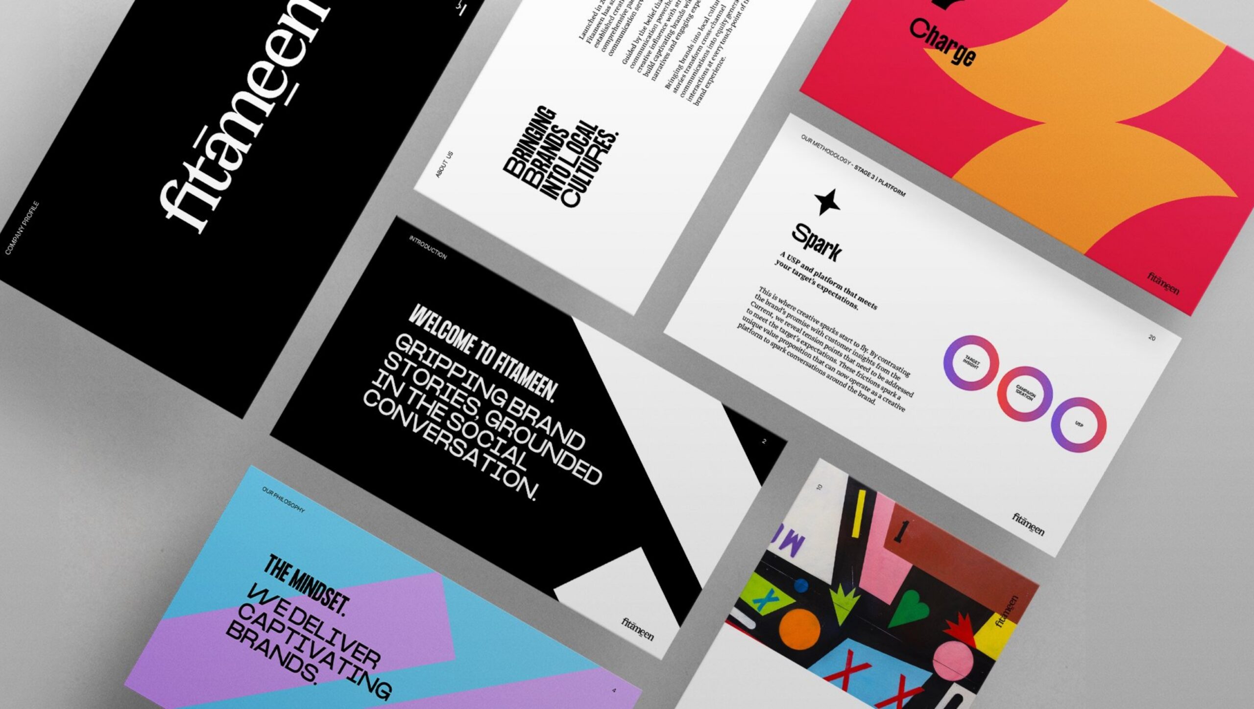
Captivate colors, and the main corporate font keep data presentations focused on the impact of the methodology.
Custom
Brand
Labs.
Get a tailored service and workshop designed for your specific work culture.

©2022 Chemistry,
a proud part of Suheil Group.